Works.
Character & 3D Mascot Development
Kawanyu: Designing a Safety
Companion Through Character
The 11 Golden Safety Rules are embedded into Kawanyu’s shell, turning the character into a living reminder of safety awareness.
Project Overview
A character designed to make formal safety messages approachable and human.
About The Name
Double Meaning
“Kawanmu”
(Your Companion)
Someone who’s always there and always reminding.
“Kawan Penyu”
(Turtle Companion)
Representing the character itself visually and philosophically.
This positions Kawanyu as not just a visual element, but a work companion in everyday situations.
From Sketch to Reality
Two early 2D conceptual explorations before translating the character into a fully rigged 3D companion.

Base Concept
Initial form exploration focusing solely on the friendly, approachable silhouette of the turtle.

Safety Integration
Integration of the safety vest and custom hardhat into the design to fit the Berau Coal identity.
Character Values
Four core pillars that define the mascot's behavioral and communicative presence.
Safety AwarenessConstantly reminding in every activity
Friendly PresenceApproachable and not intimidating
Reliable CompanionAlways there when needed
Positive EnergyDelivering messages lighter & engagingly
Safety AwarenessConstantly reminding in every activity
Friendly PresenceApproachable and not intimidating
Reliable CompanionAlways there when needed
Positive EnergyDelivering messages lighter & engagingly
Safety AwarenessConstantly reminding in every activity
Friendly PresenceApproachable and not intimidating
Reliable CompanionAlways there when needed
Positive EnergyDelivering messages lighter & engagingly
11 Golden Safety Rules
Kawanyu’s shell carries a deeper meaning. Each segment of the shell represents one of the 11 Golden Safety Rules, forming a complete layer of protection.
Just like how a turtle relies on its shell to stay safe, these principles act as a constant reminder in every activity. This transforms Kawanyu into more than just a mascot, but a visual system that communicates safety through design.
Character Personality
Personality Matrix
Why Turtle?
The turtle was chosen intentionally for deep philosophical alignment.
Represents CarefulnessAlways mindful of surroundings
Slow but SteadyPrioritizing certainty over rush
Natural Self-ProtectionInherent biological safety mechanism
Interactive 3D Preview
Experience the physical dimensions of Kawanyu. This viewport mimics the studio environment used during the `.blend` development process.

Project Assets
Front View
kawanyu-front-view.png

Back View
kawanyu-back-view.png

Side View
kawanyu-side-view.png
Kawanyu 3D
kawanyu-3d-model.blend
Kawanyu is more than just a mascot.
It’s a new way to communicate safety, more relatable, more alive, and easier to remember.
Safety Communication System
Berau Coal Kawan K3L Guideline(Safety & Branding)
Translating complex safety regulations into clear, approachable, and consistent visual communications.
Scope of Work
A visual guideline designed to ensure consistent and accessible safety communication for Kawan K3L.
Featured YouTube Project
Purwadhika TV – YouTube Content Development
Developing engaging scripts and storytelling to turn educational content into compelling videos.
Key Contributions
- Content ideation & planning
- Scriptwriting (YouTube format)
- Storytelling development
- Content direction
Video Showcase
Project Files
Content Performance Impact
Scaled Instagram engagement from 1M to 8M in 4 days through consistent and strategic content execution.
Positioning
Performance-Driven
Content Strategist
Not just a social media admin
Content Consistency Rhythm
During this period, I maintained a consistent content rhythm:
Content Showcase
This project goes beyond content creation. It focuses on understanding audience behavior, building consistency, and creating content that performs.


Purwadhika Alumni Club – Social Media Handling
I also managed another account within the same ecosystem, focusing on alumni engagement and community-driven content.
This required a different approach, with content tailored to maintain connection, relevance, and long-term audience interaction.
Strategic Highlight
This project reflects the ability to scale content strategy across different audience segments while keeping a unified brand voice. Managing multiple accounts within the same brand requires more than just content creation. It’s about understanding different audiences, adjusting tone, and maintaining consistency across platforms.


Study at Purwadhika – Lead Generation Focus
This account focuses on attracting new audiences and converting interest into potential students.
The approach here is more conversion-driven, balancing informative content with persuasive storytelling.
Ecosystem Funnel
Ecosystem Thinking
Each account serves a different purpose. While the main account focuses on reach and awareness, and the alumni account focuses on community, this account is built to drive interest and conversion.
Managing a multi-account ecosystem to drive awareness, engagement, and conversion.


SOD Purwadhika – Design & Creative Program
This account focuses on design-related programs, including Visual Design and UI/UX.
The content is designed to attract creative audiences, highlight learning outcomes, and build interest in pursuing a career in design.
Content Direction
Strategic Positioning
This account targets a specific audience interested in design and creativity. The content focuses on visual appeal, clarity, and inspiration to attract future designers.
Design-focused audiences respond strongly to visual storytelling. This is why the content emphasizes aesthetics, structure, and outcome-driven messaging.


EBER GroupEBER PetrochemicalWebsite Experience &
Marketing Integration
Not just improving how it looks, but how it works.
A strategic approach combining UI/UX improvements with functional marketing features to enhance user conversion.
This project is not just about making the website look better.
It’s about making every element have a purpose.
Website Preview
ebergroup.comCore Contribution
UI/UX improvement and layout refinement
Website flow optimization
Content structuring and storytelling
Copywriting for web pages and articles
Feature development based on user behavior
Marketing-driven thinking in product experience
UI/UX improvement and layout refinement
Website flow optimization
Content structuring and storytelling
Copywriting for web pages and articles
Feature development based on user behavior
Marketing-driven thinking in product experience
Custom Product Experience
Content & Article Development
A harmonious integration of aesthetic design and performance-driven marketing.
Eber Petrochemical – LinkedIn Content Strategy
Building corporate presence through strategic content.
Developing informative and brand-aligned LinkedIn content to strengthen corporate credibility.
Content Objective


Content Approach
"At Eber Petrochemical, we are proud to push the boundaries of industrial production through our Petrowidada Phthalic Anhydride facility. Our commitment to high-quality chemical derivatives ensures that we continue supporting global supply chains efficiently and safely."
Open Post"Celebrating National Batik Day with a reflection on sustainability. At Eber Petrochemical, we balance industrial advancement with the preservation of cultural heritage and environmental consciousness. Our sustainability initiatives are dedicated to a greener, localized future."
Open Post"HDPE remains one of the most versatile polymers in the petrochemical industry. We are continuously improving our high-density polyethylene production to meet complex industrial demands, focusing on durability, longevity, and superior quality."
Open Post"Behind every industrial milestone is an exceptional team. In this edition of #EberImpact, we highlight the people who drive innovation at Eber Petrochemical. 'Know Your People' is more than a slogan; it's our core operating philosophy."
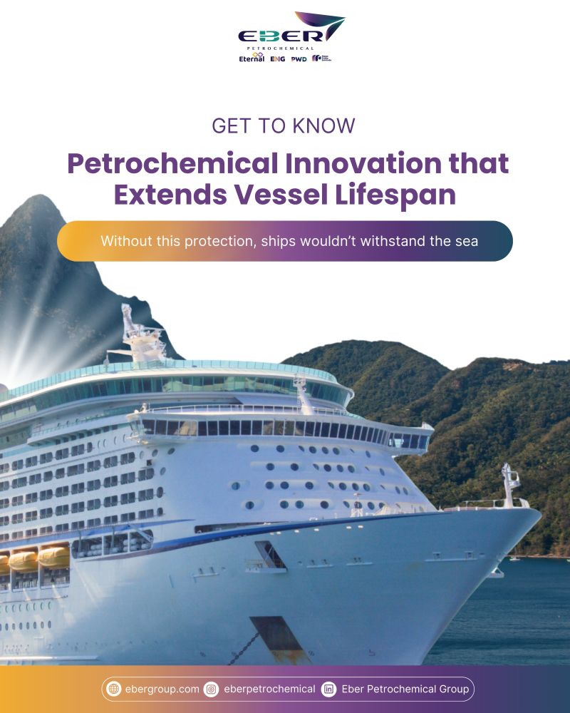
Open Post"Protecting maritime assets requires cutting-edge chemical solutions. Our latest insights into marine coating applications demonstrate how Eber Petrochemical is leading the formulation of robust, anti-corrosive materials for the global shipping industry."
Open Post"Happy National Consumer Day! We deeply appreciate the trust our global partners place in our chemical solutions. Customer appreciation isn’t just a one-day event—it’s embedded in our commitment to continuous operational excellence and reliability at Eber Petrochemical."
Open Post"Strengthening corporate credibility through professional, value-driven content."
Brand Overview
This guideline ensures consistency across all brand communications. It is designed to emphasize reliability, professionalism, and industrial precision for EBER Petrochemical.
01 / LOGO SYSTEM
Standardized logo placement, safe areas, and background adaptation.
Subsidiary Architecture
Eternal
Focused on sustainability and continuous progress. The seamless and modern design represents longevity, highlighting the company's commitment to creating lasting, future-proof chemical solutions.
Petrowidada
Highlighting dynamic energy and technological precision. The sharp, forward-leaning edges reflect agility and a forward-thinking mindset crucial for modern industrial challenges.
Mega Prima
Symbolizing leadership and paramount quality. The bold monolithic structure of the identity stands for undeniable strength and the company's position as a tier-one industry contributor.
Eterindo
Inspired by the synergy between the environment and advanced chemical processing. The interwoven concept reflects a harmonious balance between industry and localized natural resources.
02 / COLOR PALETTE
The foundational 5-color system structured strictly by dominance and structural function.
Deep Navy
#15133CPrimary background color. Dominant usage across layouts.
Electric Purple
#4B2A86Secondary depth color. Used in gradients and layered backgrounds.
Teal Green
#1F8A7ABrand accent color. Used in key highlights (e.g. logo emphasis).
Cyan Blue
#2F6F8FSupporting gradient tone. Adds modern and technical feel.
Warm Orange
#F5A623Accent highlight. Used sparingly for emphasis (CTA, highlight elements).
03 / TYPOGRAPHY
Heading
Subheading
Body text elements
04 / VISUAL ELEMENTS
Defined shapes and visual boundaries.
05 / IMAGERY STYLE
06 / LAYOUT SYSTEM
Grid-based flexible structures.
07 / APPLICATIONS
Social Media
Logo placed top/bottom corner consistently
Banner
Logo top-left or center based on hierarchy
Website
Consistent header placement
Multi-Platform Thinking
Each platform has its own behavior and audience. This guideline bridges those differences by creating a flexible system that works across:
A unified visual foundation for Eber Petrochemical.
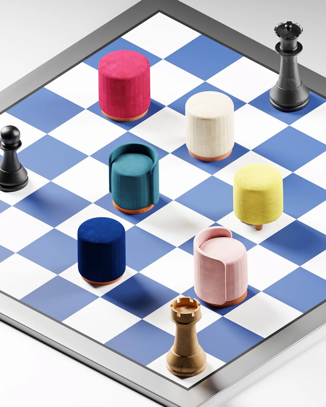
Dekornata Digital Ads Campaign
Driving performance through strategic digital campaigns & e-commerce growth.
Driving traffic and increasing e-commerce sales performance.
Key Achievement
2 Billion IDR
Return on ad spend (ROAS) on Shopee
Marketing Thinking
Combining creative content with data-driven optimization for scalable results.
"Performance marketing is not about how content looks but how it performs."
Content Showcase
Converting native social content directly into measurable e-commerce revenue.
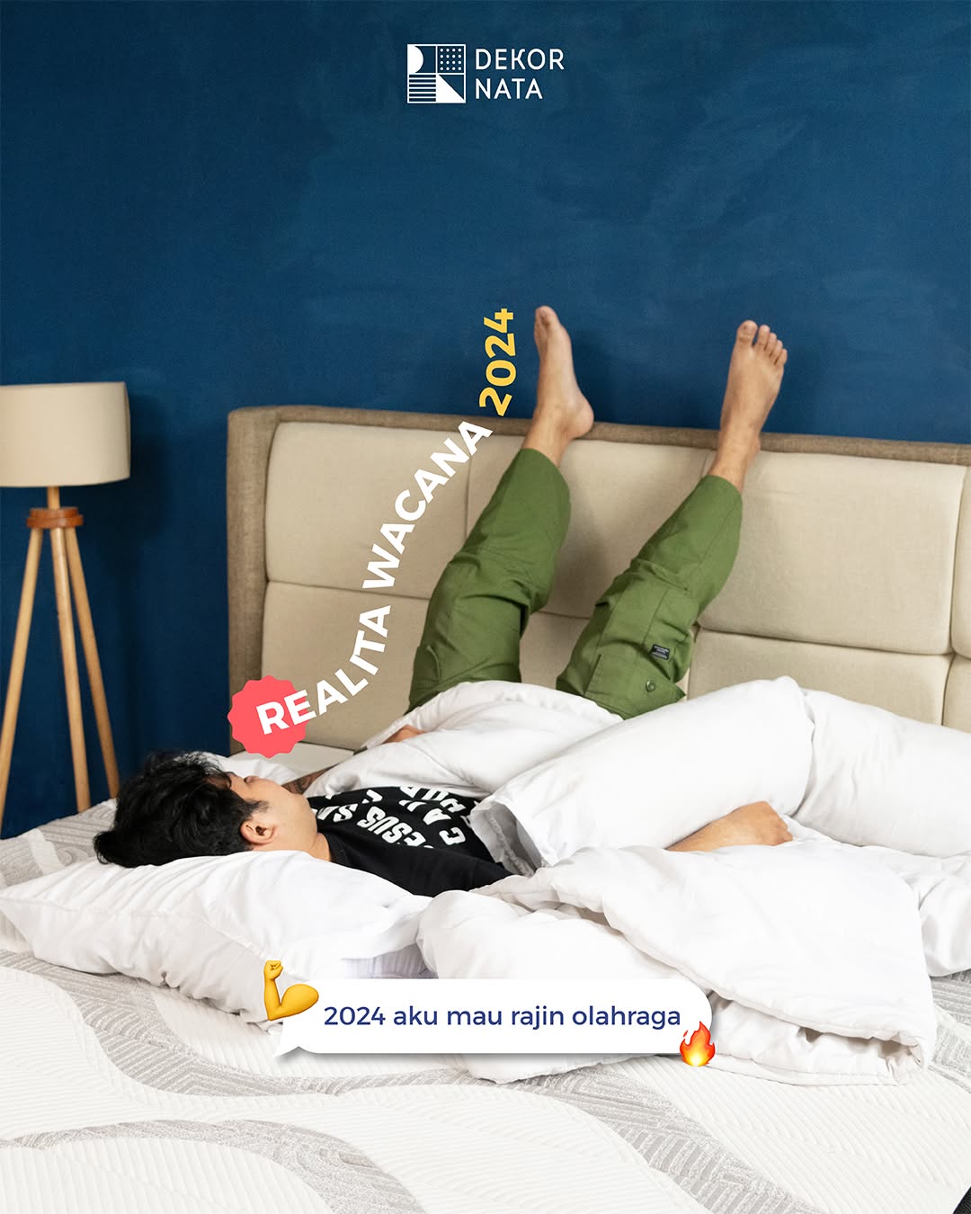
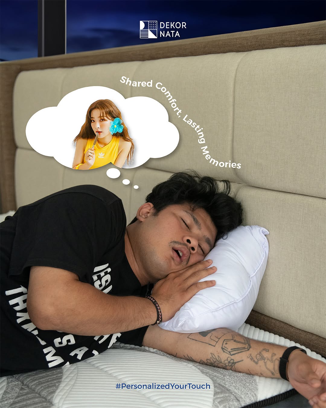
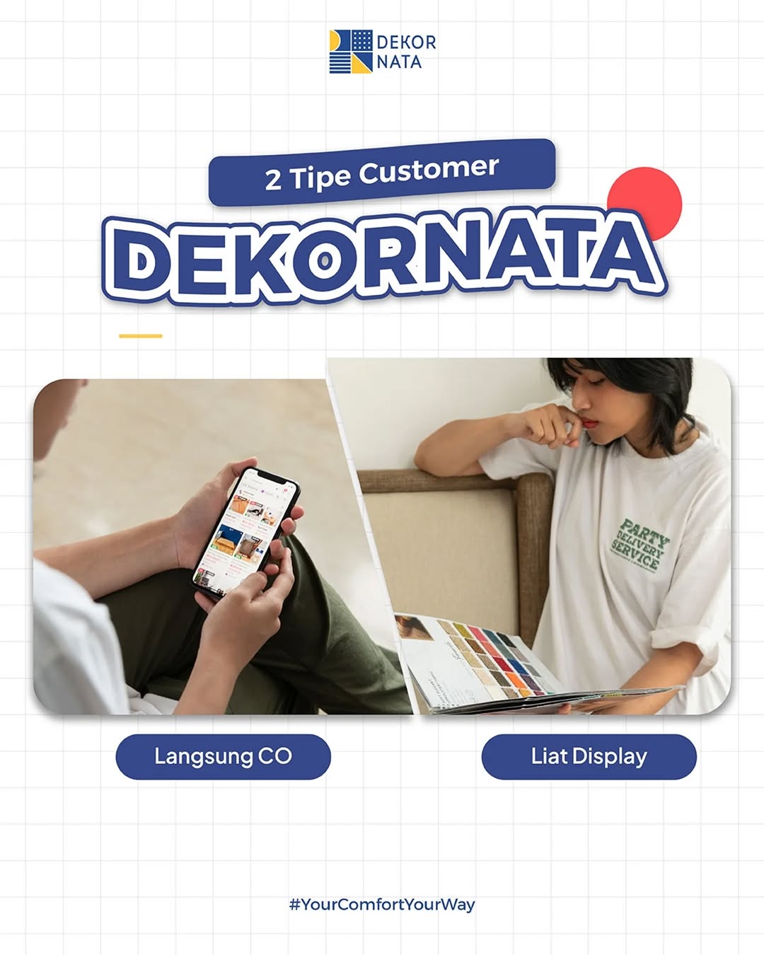
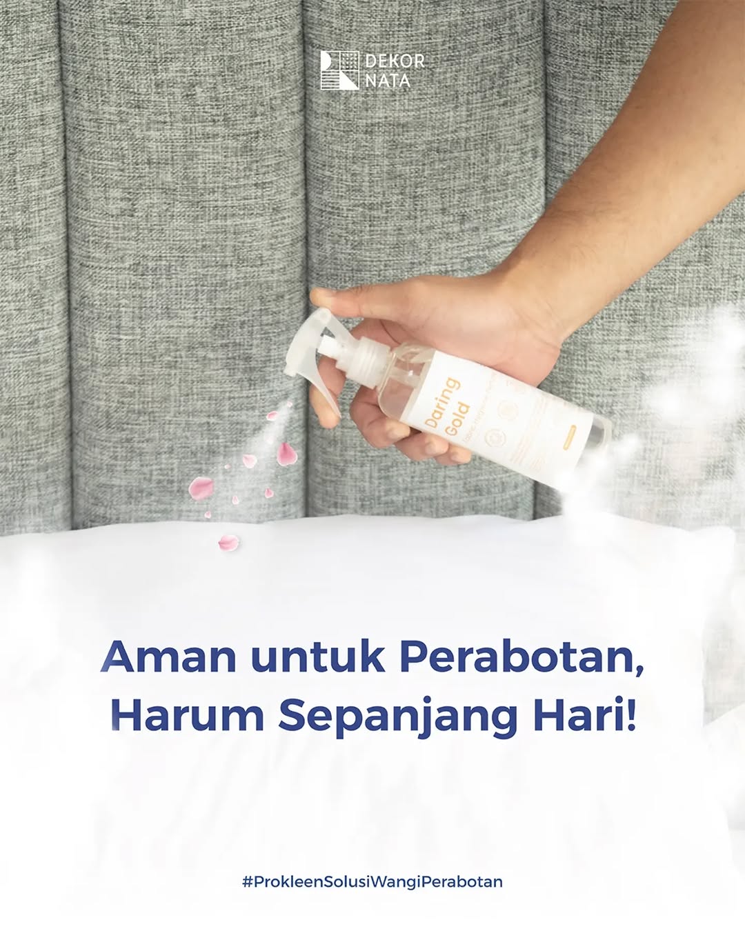
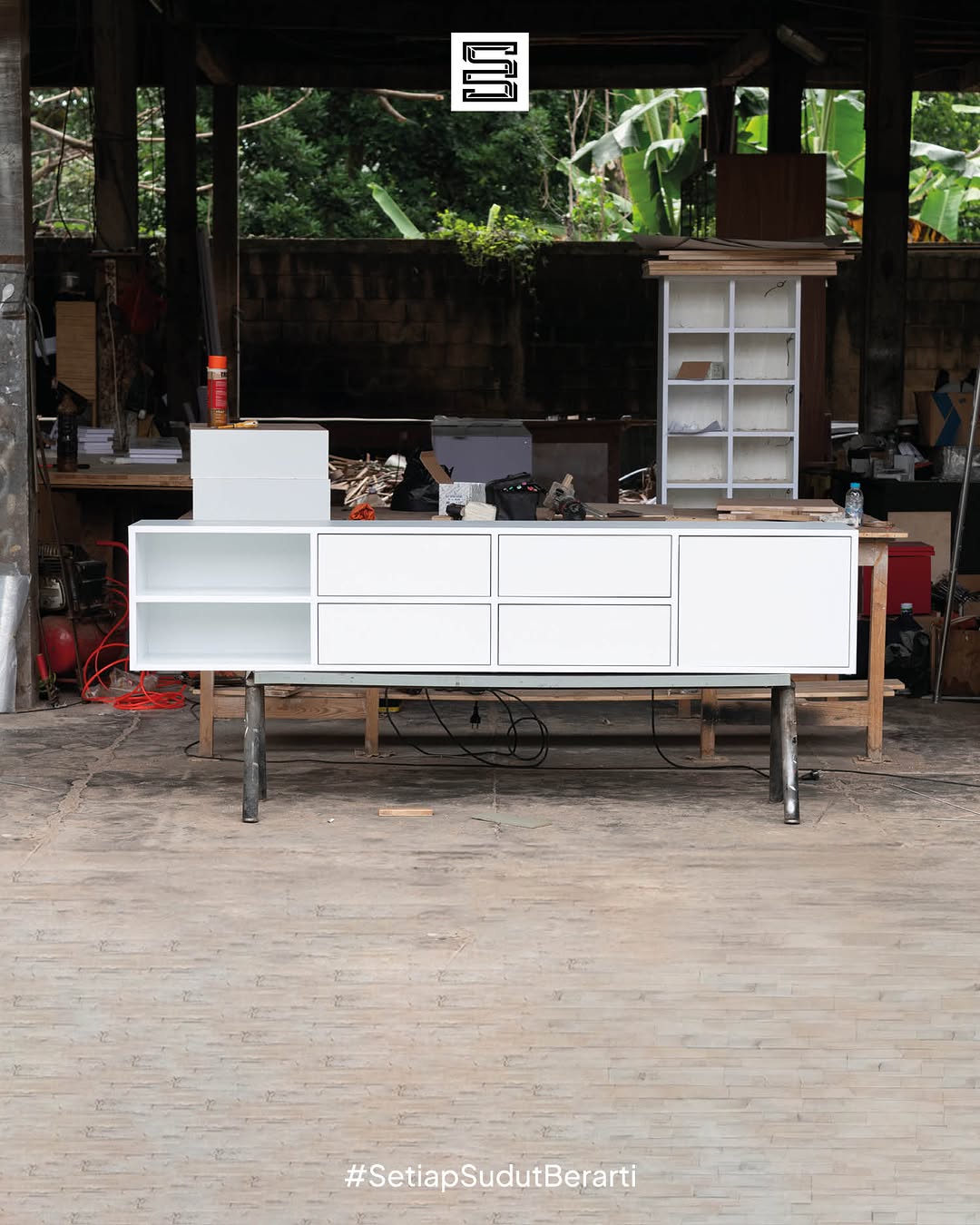
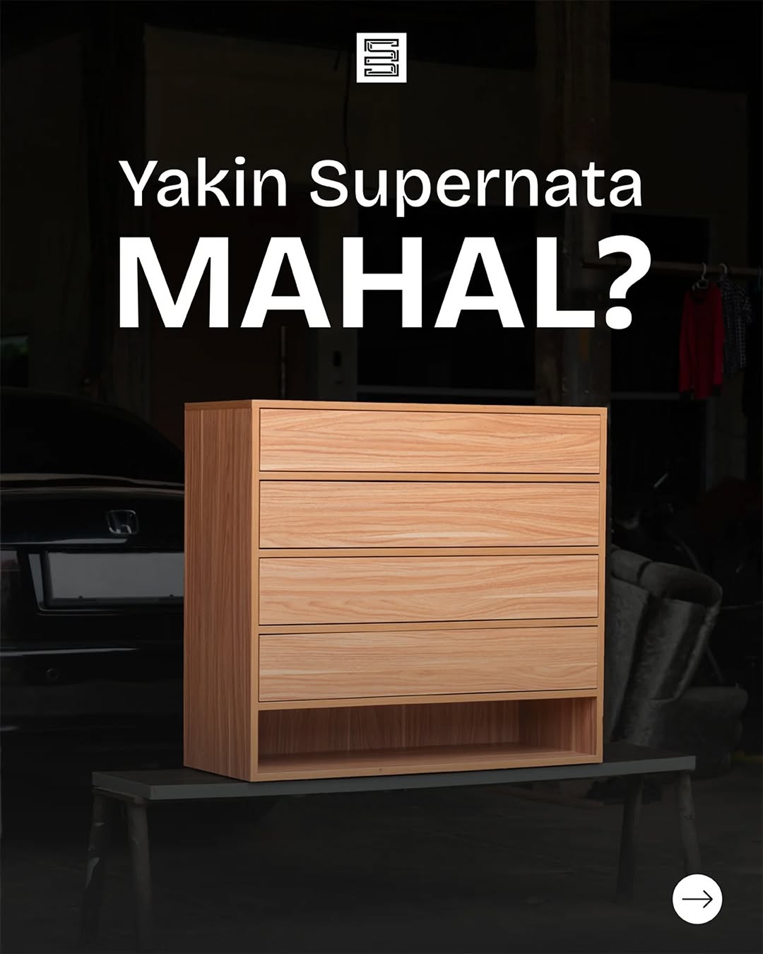
Supernata Content Development
Turning everyday content into something people actually connect with.
Driving real connection and viral reach through relatable, organic storytelling.
Key Highlight 🔥
224K Views
Achieved organically through strong copywriting
Strategic Thinking
Organically driving engagement and virality through human-centered copywriting.
"Good content is not forced, it connects."
Content Showcase
Explore snippets of relatable storytelling that shifted casual scrollers into actively engaged audiences.
"This project highlights how copywriting and storytelling can directly influence content performance."
Dekornata E-Commerce Performance
Turning product discovery into high-converting sales engines.
This project focuses on managing and optimizing Dekornata’s presence across e-commerce platforms. The goal is to improve product visibility, increase conversions, and create a better shopping experience.
Key Achievement 🔥
2 Billion IDR
Total ROAS generated through e-commerce marketplace ads
Conversion Thinking
Structuring information and visuals to smoothly guide users toward purchasing.
"In e-commerce, a product page without proper visual hierarchy is simply an invisible catalog."
Marketplace Architecture
Highly structured desktop-first grids to preserve the brand narrative and simplify SKU navigation.
Tokopedia Optimization
Tokopedia Campaign &
Visual Copywriting
Developing campaign visuals and direct copywriting for promotional events.
Strategic Value
"Marketplace campaigns are about timing, clarity, and visibility."
Connecting visuals with clear copywriting to create highly effective promotional campaigns.
Campaign Context
- 11.11 Campaign
- Double Date Promotions
- Special Marketplace Events
Role & Contribution
Campaign Approach
Combining strong visuals with concise messaging to capture attention and increase engagement.
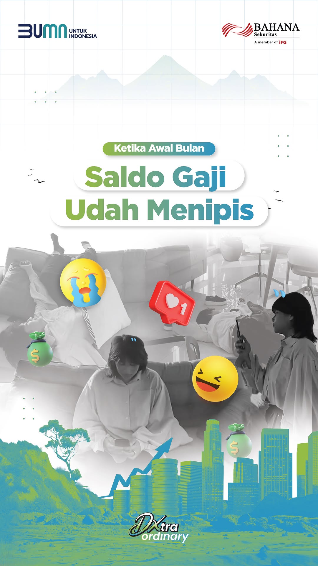
Bahana Sekuritas – Content & Video Performance
Turning ideas into content that people actually watch.
This project focuses on Instagram content creation for Bahana Sekuritas, with a strong emphasis on video performance. The role includes both copywriting and on-camera talent, creating content that is not only engaging but also watchable.
Role & Contribution
- Copywriting for social media content
- Acting as on-camera talent for reels
- Developing content ideas and scripts
- Adapting content for cross-platform
Strategic Positioning
This project focuses on creating content that people actually watch. Instead of optimizing for likes, the focus is on retention and views, making sure the content performs in a video-first environment.
Talent Presence
Being directly involved as on-camera talent adds another layer to the content. It allows for more authentic storytelling and stronger audience connection.
Cross Platform Thinking
The content is also adapted for TikTok, ensuring consistency while maximizing reach across platforms.
"Content performance is not only about engagement, but about how long people stay and watch."

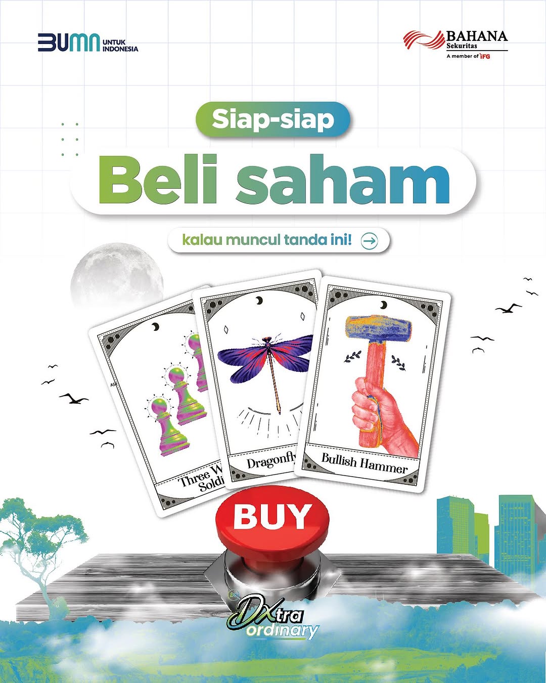


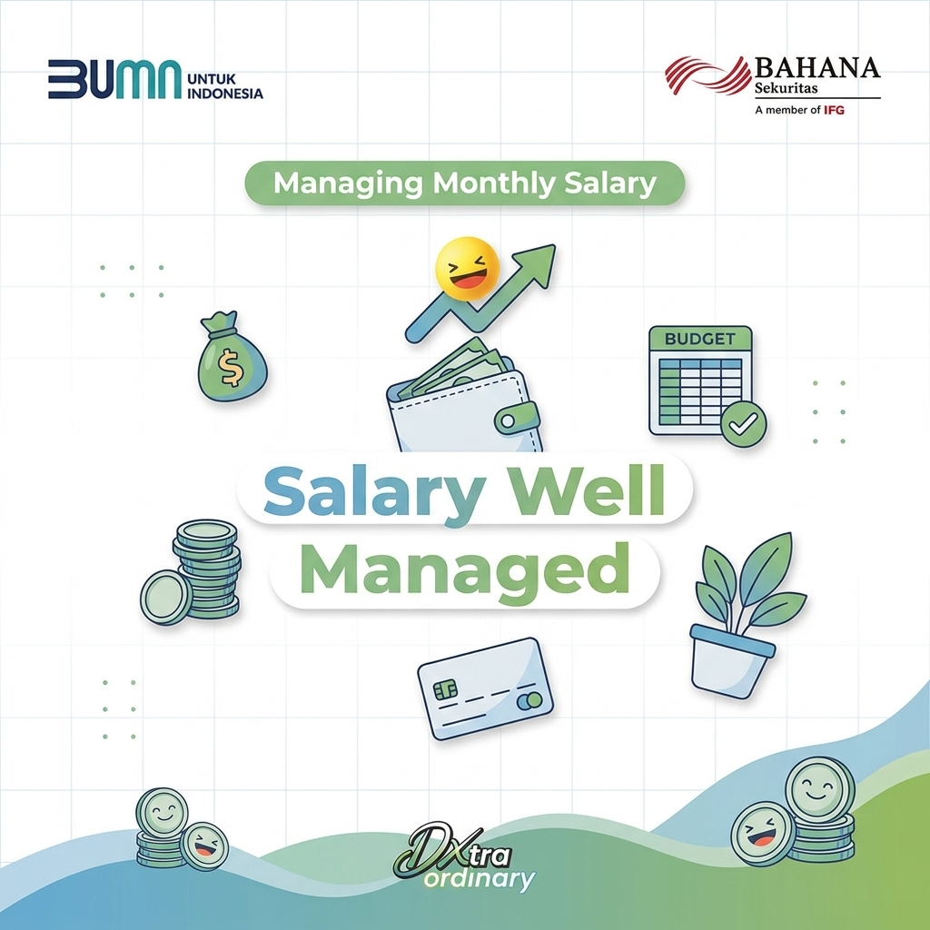

This project highlights the combination of strategy, execution, and presence.Not just creating content, but becoming part of it.
EBER Magazine – Editorial Design
From print to digital, building a cohesive editorial experience.
Developing a consistent editorial identity across printed publications and immersive digital e-magazines.
Scope of Work
Printed Magazine
Print editorial grid layouts focusing on natural typography and visual hierarchy.
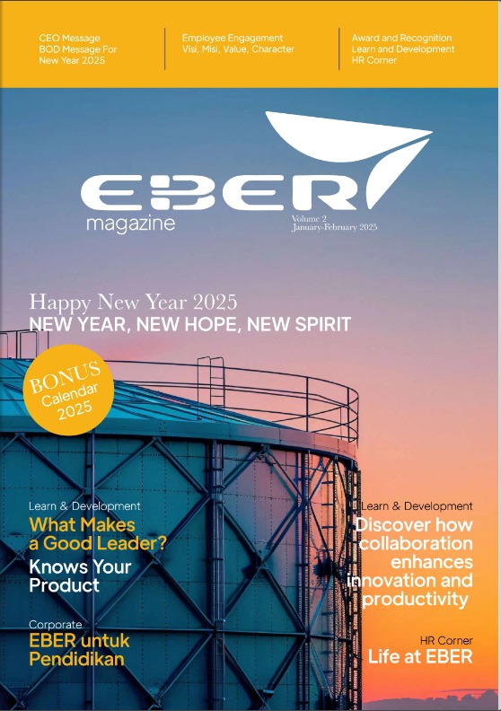


Digital Experience
Immersive WebGL e-magazine flipbook interface perfectly adapted to diverse screen sizes.
Interactive Viewer Pending
The flipbook engine might be restricted on certain browsers. You can cleanly bypass this viewing the original architecture externally.
Open MagazineEBER Magazine represents a combination of design, content, and storytelling.A publication that connects brand communication with audience experience.
Eco Packing Website Development
Building a digital presence from scratch with purpose and strategy.
End-to-end website development designed to support core business goals.
Website Structure
UI/UX Implementation
Content Structuring
Copywriting
User Flow Optimization
Marketing Driven Approach
Strategic Approach
Creating a digital system that clearly communicates value and drives business growth.
Marketing Perspective
Structuring content for maximum user engagement and readability.
User Flow Thinking
Eco Packing E-Commerce Performance
Beyond building the website, this project also extends into marketplace performance.
Driving visibility and increasing sales across platforms.
Top 1 Selling Category
Achieved #1 top selling product status on Shopee.
Shopee Integration
Mobile Interface Layout
Strategy Explanation
Maximizing product positioning to attract attention and drive conversions.
Tokopedia Integration
Desktop Interface Layout
Business Impact
Translating digital strategy directly into measurable sales performance.
Eco Packing represents a complete process of building a digital presence from zero.Combining design, content, and strategy into a single experience.
Eco Packing – Instagram & Brand Visual Development
Redefining the brand through visual identity and content.
After building the website and marketplace presence, the next step was strengthening the brand through Instagram. This includes redesigning the logo and creating a more consistent visual direction across content.
Logo Redesign
One of the key parts of this project is redesigning the Eco Packing logo. The redesign focuses on improving clarity, scalability, and consistency across digital platforms.
Approach
- Simplifying visual elements
- Improving readability at different sizes
- Ensuring adaptability for social media and marketplace
- Creating a cleaner and more modern look
Interactive Comparison
Visual System Extension
The logo redesign becomes the foundation for the overall visual direction on Instagram. This includes layout consistency, color usage, and how content is structured visually.
"A strong identity is not only built through a logo, but through consistent visual execution."
This project is not only about improving visuals. It is about shaping how the brand is perceived across platforms.
Eco Packing Instagram becomes an extension of the brand system, connecting identity, content, and communication seamlessly.
Unlock More Projects?
I have several high-impact case studies currently locked under NDA. Let's start a conversation to discuss these exclusive projects in detail.